Ideas made real.
Selected case studies and projects: each imprint tells a story of intention, transformation and tangible outcome.
I don't present isolated mockups, but ecosystems: a starting intention, decisive choices and deliverables that genuinely serve the business. Four projects illustrate this approach today, from brand positioning to digital product design.
- 01MORESOPremium apparel brand
- 02LauryLocal at-home service
- 03Hardmusic CultureEditorial digital media
- 04LAUFREYAI-enhanced entrepreneurial product
Building a premium apparel brand, from identity to collection.
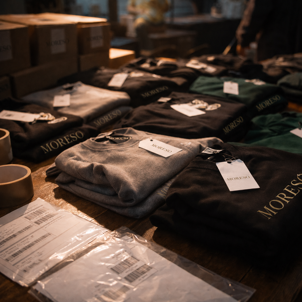
MORESO is conceived as a coherent brand, where visual identity, art direction, textile collection, content and e-commerce universe all move in the same direction.
- Nature
- Premium apparel brand
- Role
- Strategy, identity, art direction, e-commerce
- Status
- Project in development
The intention
Move beyond a simple printed garment to lay the foundations of a statutory, demanding and lasting brand. The goal: a recognizable signature, a clear art direction and a shopping experience worthy of the positioning.
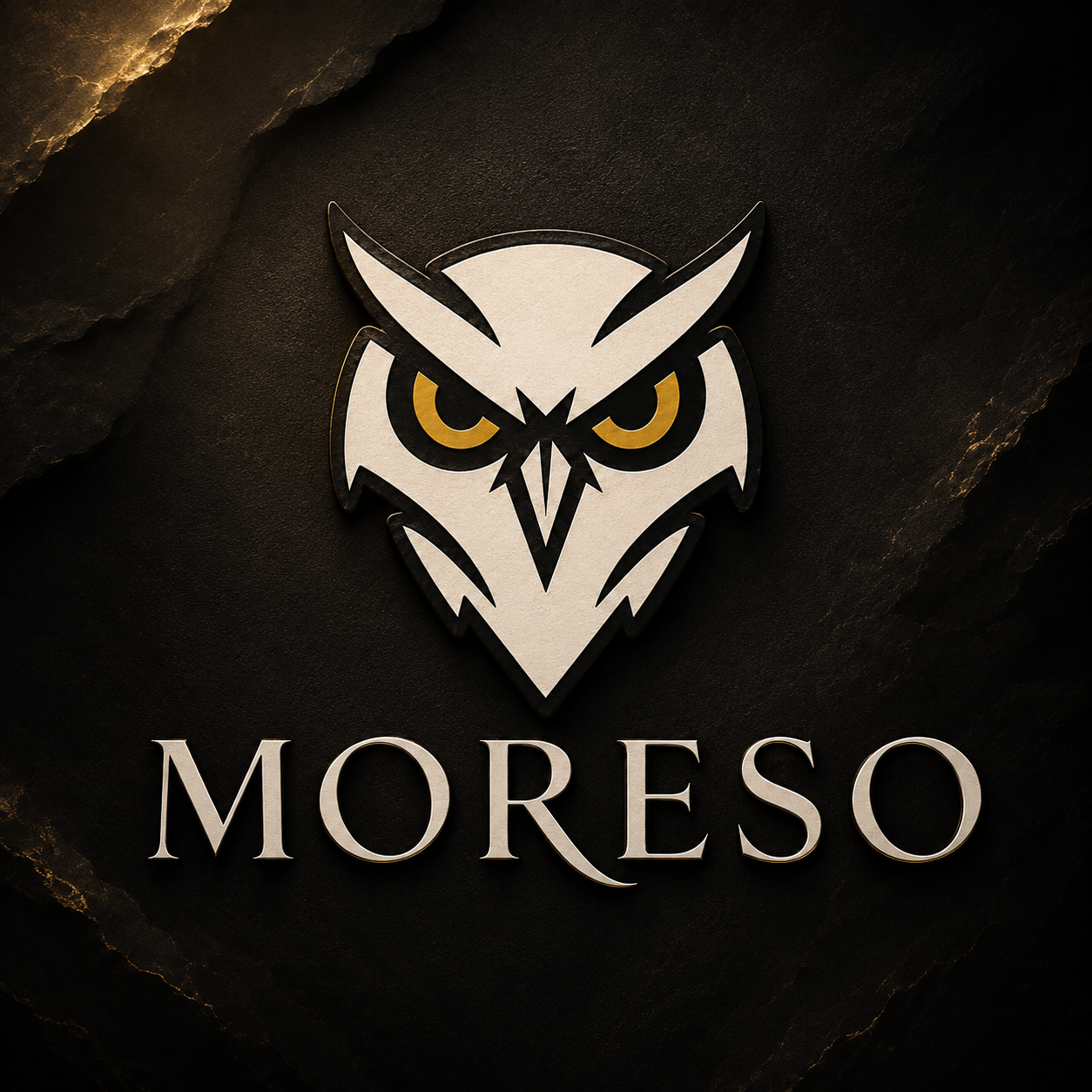
The MORESO wordmark is treated as a bespoke, hand-drawn signature: it structures the entire visual system and is never distorted or replaced.
 Brand signature
Positioning
Clarifying the brand promise, creative territory and intended price tier.
Identity & signature
Bespoke wordmark, typographic system and a charcoal, textile ivory and patinated gold palette.
Collection & art direction
Consistency across pieces, finishes, labels and presentation visuals.
E-commerce universe
A clear purchase journey, polished product pages and content aligned with the brand.
Clarifying a local offer and simplifying contact.
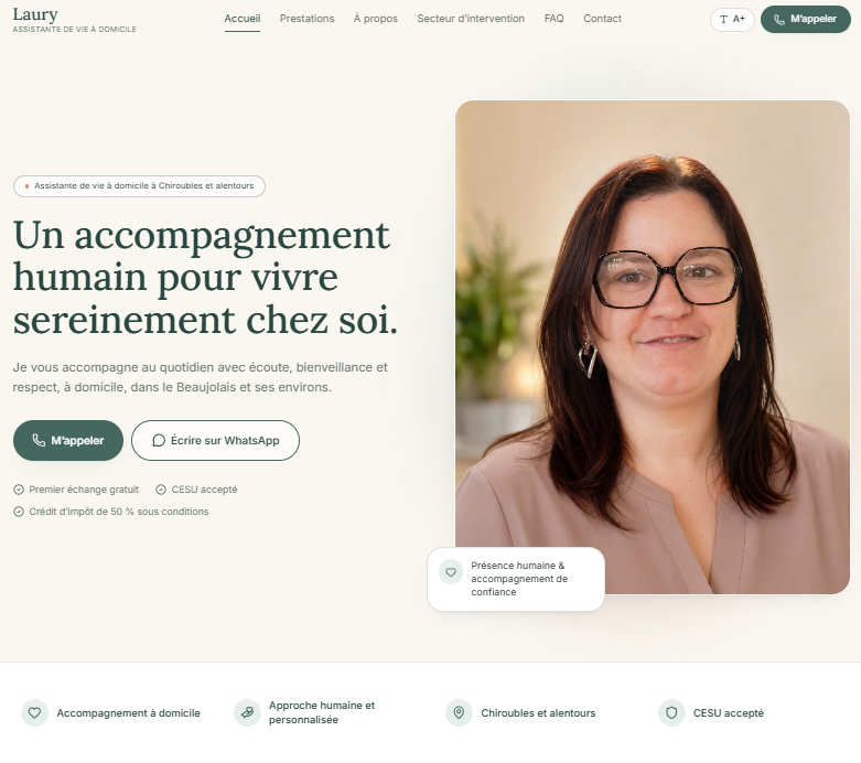
Redesign of an independent at-home assistant's website: a clearer presentation of services and a direct path to requesting a callback.
 View the site
- Nature
- Local service showcase site
- Role
- Redesign, UX/UI, forms
- Area
- Within roughly 30 km around Chiroubles
The intention
A personal-care service business runs on trust. The site therefore had to reassure immediately: say who is providing support, for which needs, in which geographic area, and allow contact to be made within seconds from a phone.
Hierarchy & readability
A clear structure of areas of intervention and calm visual cues.
Local anchoring
An explicit service area: within roughly 30 km around Chiroubles.
Callback request
A short, accessible and reassuring form, designed mobile-first.
Navigation comfort
Readable text, generous touch zones and a journey without detours.
Structuring a specialized media outlet and making its culture accessible.
A digital media outlet dedicated to the history, evolutions and debates running through hardmusic, designed for clear reading on every screen.
The intention
Give a demanding musical culture an editorial space worthy of it: a content architecture able to host varied formats, and a reading experience that puts substance first without giving up visual character.
Editorial strategy
Defining the main content families and the publishing rhythm.
Content architecture
Categories, navigation and flow between articles designed for exploration.
Reading experience
Typography, heading hierarchy and contrast refined for long-form text.
Dark UX/UI
A sober interface that leaves room for visuals and stories.
Scenes, sounds and stories of a culture documented over time.
- Nature
- Editorial media
- Role
- Editorial, UX/UI, web
- Status
- Live
Giving clear direction to people who want to build a business.
A personal project bringing brand strategy, identity, UX/UI and product definition together around one promise: less noise, more direction.
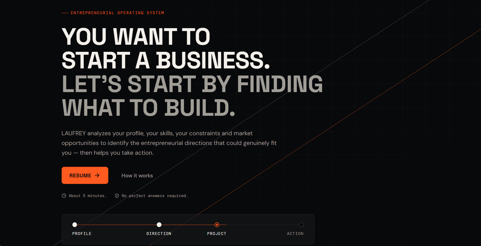
The approach
The work began with the brand foundations and platform, before translating that vision into visual rules and a product journey. The questionnaire is only an entry point: the intended core is a living project bringing together decisions, hypotheses, validation, roadmap and actions.
Starting point
Close the gap between wanting to start a business and turning that intention into a concrete project.
Brand platform
Position a copilot that analyses, explains and proposes without deciding for the user or promising success.
Visual identity
Build a dark, precise and directional system where orange signals decisions and next actions.
MVP design
Move the user from profile to three directions, a decision, a living project and one clear next action.
- Nature
- Digital product
- Role
- Personal project — strategy, brand, UX/UI and product design
- Status
- In design
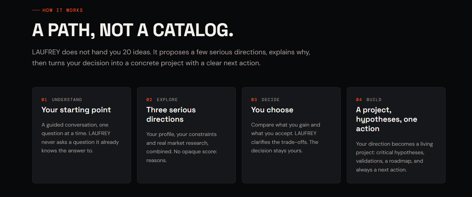
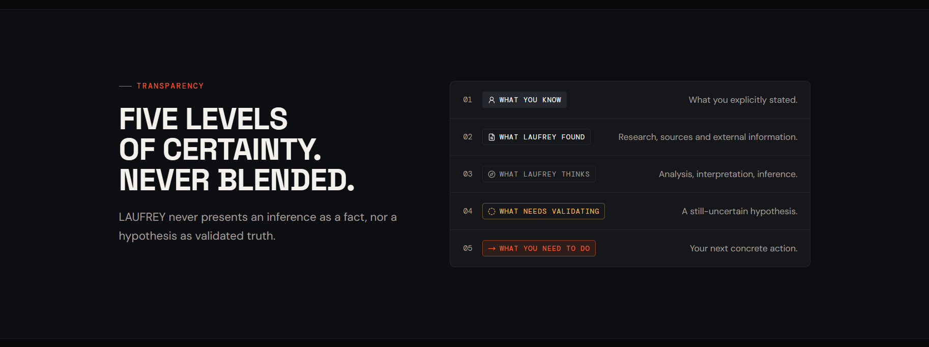
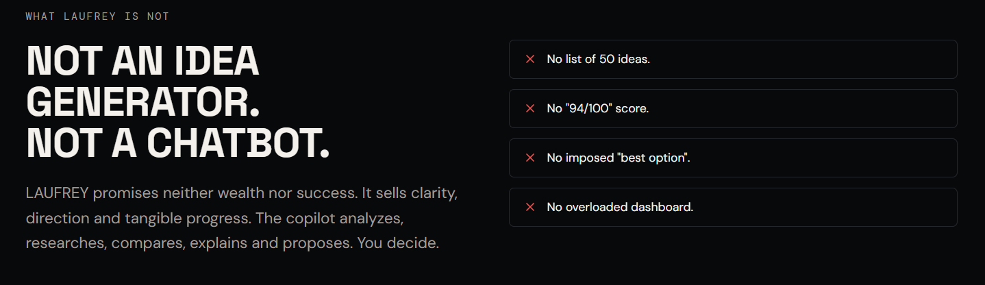
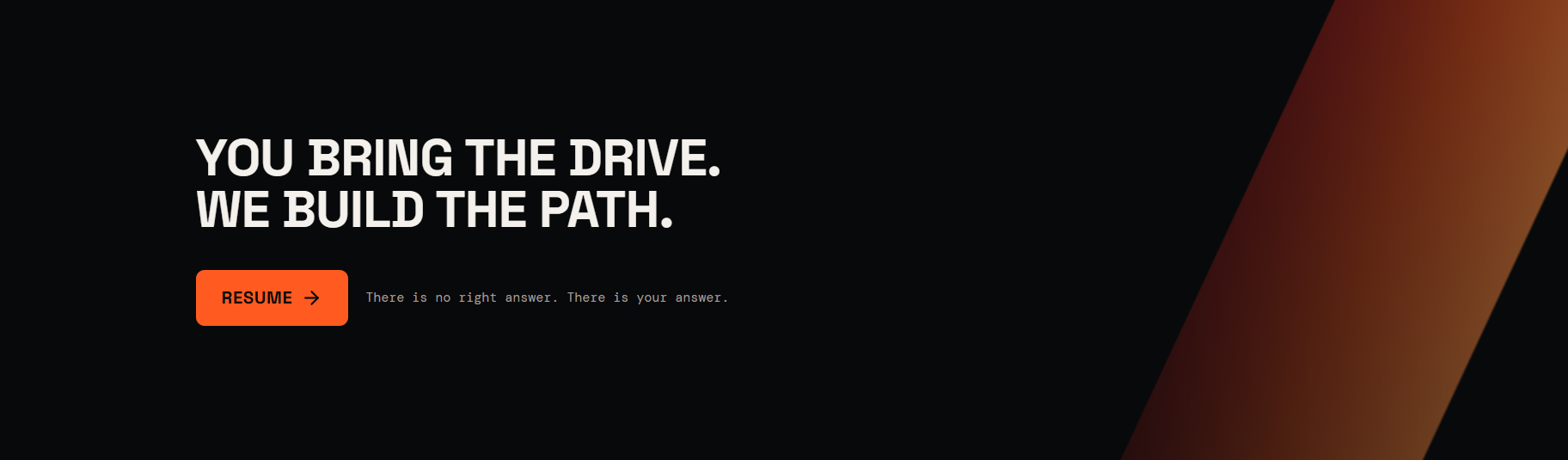
Current state: strategy, brand platform, visual system and MVP design are defined. The landing page is complete; the full application remains in design.
Some projects aren't seen. They're worked on.
Internal interfaces, dashboards, client portals and automations: The Lab gathers the more functional explorations I lead alongside brand projects.
Your project deserves a strong direction.
Tell me about your project: I'll tell you what feels right, proportionate and genuinely useful to build first.